 For those of you who haven’t heard yet, there is a Mobile Apocalypse coming. No, I don’t mean the kind of apocalypse where you’ll have to board your windows and hide in a bunker. Instead, Google made an announcement that will affect every business who has a web presence. Here is Google’s statement:
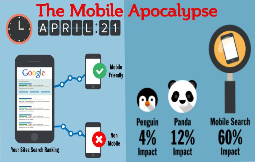
“Starting April 21, we will be expanding our use of mobile-friendliness as a ranking signal. This change will affect mobile searches in all languages worldwide and will have a significant impact in our search results.”
Wait, what does this mean? Will my website be affected? The short answer is yes. But first, a little more about what this announcement means in terms of search engine rankings.
Google’s announcement is a welcomed heads up for any business who has a website that is visited or searched from a mobile device. This is giving us time to prepare before the apocalypse hits on April 21. Websites that are mobile-friendly will be positively rewarded with higher search engine results rankings. If your website isn’t optimized for a mobile device, this could negatively impact your mobile traffic, pushing you down in the rankings and ensuring that you will have to almost completely rely on desktop traffic. In these days of heavy mobile usage, relying completely on desktop traffic would be catastrophic for your business. This means lower traffic and will ultimately result in less revenue.
Now that you understand the severity of the situation, you can remedy it by making sure your website is optimized correctly. There are two ways to do this.
Responsive web design is a good way to make sure you have a mobile-friendly website. The great part about responsive web design is that you only have to have one website, and that website will adjust to the size of the screen it is being viewed on. This is a great way to optimize your website without having to worry about creating and maintaining more than one website.
Another way is to create a mobile website. This route will ensure that your site is mobile-friendly since it is created solely to be viewed on a web device, but it can be a bit of a pain in the neck to maintain since you now have to worry about two separate websites.
Whichever solution you go with, you can rest easy knowing that your website will continue to be shown in mobile search engine rankings. After all, 60% of web traffic comes from a mobile device.
For more information contact SerpHaus SEO by phone (561) 922-8613 or by Email